Cracker down.
The new logo sucks but the fact that you can lose $100 million because the little graphic above your store looks slightly different really demonstrates how fucking dumb capitalism is
I hope they overcorrect and change the logo again to have one of the following
- twin barrels with a cracker flying into them
- a cracker crucified onto a stack of barrels
- change the cracker to have Sidney sweeney’s face with two DD barrels on her chest
- change the name to 1488 Hitler Barrel MAGA
Ah, the Steak N’ Shake Gambit
Can I get some context here?
A Reddit link was detected in your comment. Here are links to the same location on alternative frontends that protect your privacy.
just waiting for the all caps trump truth followed by the order for the DOJ to investigate their CEO
They should’ve added a second barrel.

Could you imagine how many The Middle Easts we would’ve nuked if Al Qaeda came after our cracker barrels!?
 Barrel yes,
NFTs: watch how this jpg makes money disappear
Cracker Barrel: you are like a little baby watch this
This is a sad day for all pep peps and meemaws

To be fair the new logo is awful corporate minimalism
All of these shopping-mall-parking-lot restaurants are getting rolled up. Cracker Barrel might have a different ownership model which protects it from private equity but they aren’t long for this world.
Red Lobster is the baseline specimen for all of this. RL was spared during the recession because they owned all of the land their restaurants were on, meaning they didn’t have to deal with skyrocketing rents, but private equity made them sell all that land (to a different company also owned by the same private equity firm) and start paying skyrocketing rents and hey wouldn’t you know they went bankrupt.
right out of the IMF playbook
Iirc it was a Thai conglomerate that also made Red Lobster source their seafood from them. Even the unlimited shrimp was a scam.
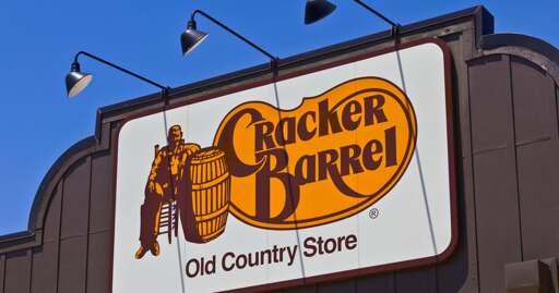
The logo no longer has the barrel OR the cracker.
Why on earth would they think that a brand that’s built entirely on being rustic and kitchy needed some flat minimal logo.
All companies eventually cut costs to an absurd amount, even if it goes against the brand with which they started. I would venture to guess that all this started with cutting costs on building new locations and maintaining old ones. They’re fairly large stores and require a lot of decorations in the form of fake, maybe some real, antiques. It’s a restaurant so all these things hanging on the walls need to be cleaned regularly. There is cost in buying decorations, storing them, transporting them, and cleaning them. They have to be replaced if customers break them or they get too dirty. If you’re cutting costs, start with cleaning up the decor. They already did this and that’s them removing part of their brand.
Same with the grand fire places. I’m not sure if newer stores even have the fireplace, but I would bet they don’t. The fireside checkers thing took up space that could go to the kitchen, dining room, or retail areas.
If you’re cleaning up the physical locations, stripping them of detail, you’re changing the brand. Might as well change the logo as well to reflect the new experience. Plus the logo looks cleaner in a mobile website layout, which is definitely where a lot of restaurants are now focusing.
All these modern changes are simply a reflection of economic measures the company takes in order to make more money. They previously trained the customer base to expect one thing, when the company was willing to spend money on it. That is no more. Now the customer base feels betrayed because they don’t look at it from the POV of a c-suite cost-cutter. They just see the customer experience and their memories of mee-maw taking them there for lunch after church when they were 12.
Capitalism creates the conditions to destroy itself.
Everything is become a bland boring mess. Suburban hell is bleak enough but fuck, can we have some variety out here?
But this is uniquely boneheaded. The old logo was distinct on the “Food” highway signs and a huge part of the “comfort” that this company represents for millions of travelers everyday. FFS they could have at least make the logo barrel shaped and it would still look great on mobile without as much backlash.
We actually looked at their balance sheet in my accounting class last night and they’ve been bleeding over the past few years.
Like shooting crackers in a barrel.
Oh noes! They removed the cracker and the barrel from the sign? Must be woke.
Enough money for hundreds of people to live comfortably the rest of their lives, just gone in an instant because of a crappy logo. The numbers mean less than a high score in a video game, at least that is connected to some kind of skill on behalf of the player.
Imagine how many homes could be built for $100 million
The most rational economic system
this is the funniest shit imaginable
“Cracker Barrel CEO’s who thought it was great to get stock options instead of a higher salary in shambles right now.”

Cracker Barrel’s board when they realize the options in his contract were puts: