

Art style in the bottom-right is referred to as “Corporate Memphis”, by the way.
Or alegria art (not be be confused with algeria).
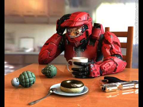
What dystopian art actually looks like

Being AI slop is the icing on the cake
So they will with due process. Lol. Lmao.
nah i think consumerism is quite good. it ensures that there’s a healthy economy while also not really damaging the planet, once we’ve got renewable energy set up.
or what was it that you’re targeting on the right side of the meme?
Where’s the Kroger commercial people I hate them so fucking much
In a Prussian, the order of the left picture must have evoked the same positive feelings as the right picture evokes in us.
Red, white and black were their colors. It’s essentially colored in the equivalent to stars and stripes.
The AI studio ghibli images get my vote for most dystopian
Yeah cause the left one is how an artists sees the true grim reality, the right one is a mask.
Take a look at Mussolini-era art, especially architecture. Many actual fascists love to represent themselves like that.
They stole a lot of it from leftist movements actually. Hitler wrote he wanted to provoke them that way but honestly they just couldn’t come up with their own stuff as usual.
Shitty soulless corpo artstyle is still better than ai “art”
They’re not mutually exclusive.
Ai generated comics look consistently off and souless. I have not seen a single good one yet.
… that you noticed
I got training on a new piece of scheduling software last week (over Teams of course, can’t be having any of that pesky human interaction!). The first slide of the presentation was a really really bad AI picture, which turned out to be a sign of the quality of the new software.
at least you know a worker has to make it
They’re the same picture.


