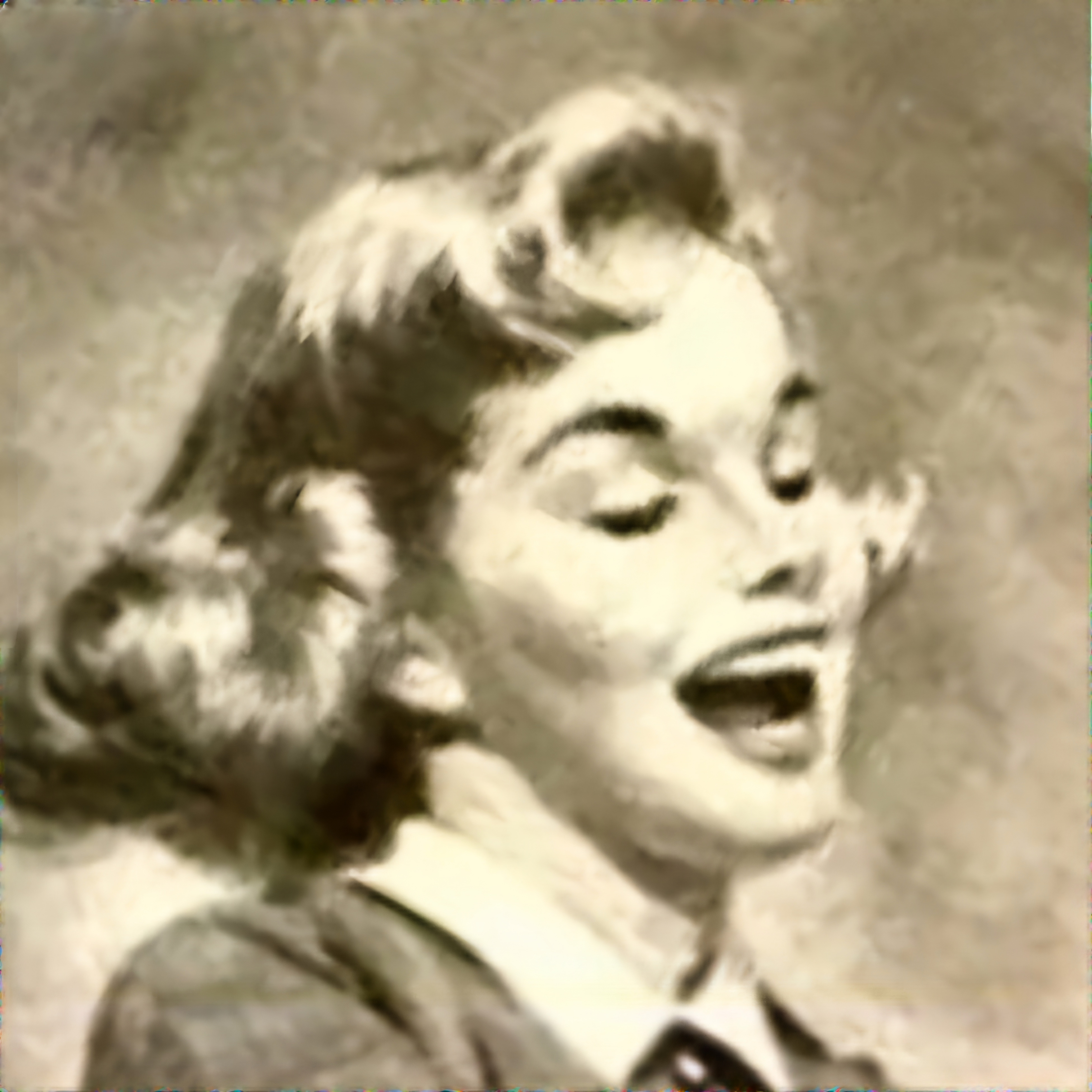
It’s really well made, but I can point out a few weird things.
Weird black thing under 圧倒的, not a Japanese character
Weird black thing between S and E of the big SEGA
There’s a belt buckle but not really a belt on her pants
The words Power, and Access on the console are illegible but clearly don’t have the proper number of letters
The Japanese copy is weird: why underline “controlpad” “in-game world” “control as you”; ます ending out of nowhere; lots of commas; miswrote Nights and Evangelion
Awkwardly separates Sega and Saturn in the logo just to show… her belt buckle?
Price is wrong
Japan didn’t require adding “+ tax” or “excl tax” until 2004.
Maybe my memory is a bit shit. But the main give away for me is that the image quality of the model seems way too high for Sega Saturn era, i.e. Early to mid 90s
Professional photography was potentially done on film negatives larger than paper on which consumers printed their photos. So I’m not sure in what way “image quality is too high”.


It’s really well made, but I can point out a few weird things.
Maybe my memory is a bit shit. But the main give away for me is that the image quality of the model seems way too high for Sega Saturn era, i.e. Early to mid 90s
Professional photography was potentially done on film negatives larger than paper on which consumers printed their photos. So I’m not sure in what way “image quality is too high”.
Yeah I can see some more AI signs now
Sry, I pressed shift + enter by accident and commented too early. There are some signs I saw above!
Its okay, I also saw the more signs your wrote.