I made this post today, https://www.reddit.com/r/BuyFromEU/comments/1quso40/comment/o3evucz/ It got 150k+ views, piefed.social etc. has seen a big spike in users.
If possible I want to copy-paste that recipe in r/BuyCanadian tomorrow to get more Canadians onboard here. But I need a nice image of a graph for the post to work.
Anyone know where I can get a graph like that? Admins?
Is it possible to get that for total daily users?
As in active users each day? I don’t have that query written but if I remember I’ll look in the next couple days
Yea these graphs won’t really work for making a good reddit post.
If and when I can find one I’ll make a post, which should hopefully add a few hundred more users here
Assuming I ran the queries correctly
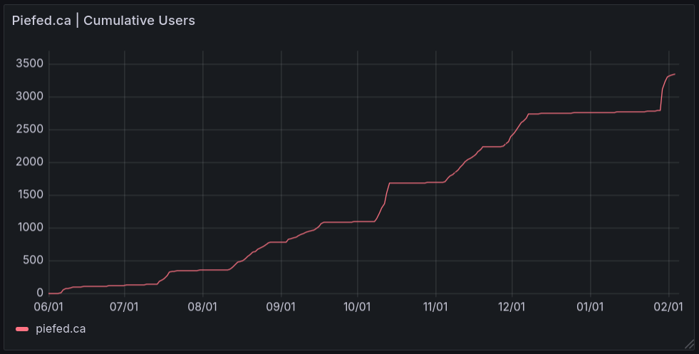
Past 8 days:
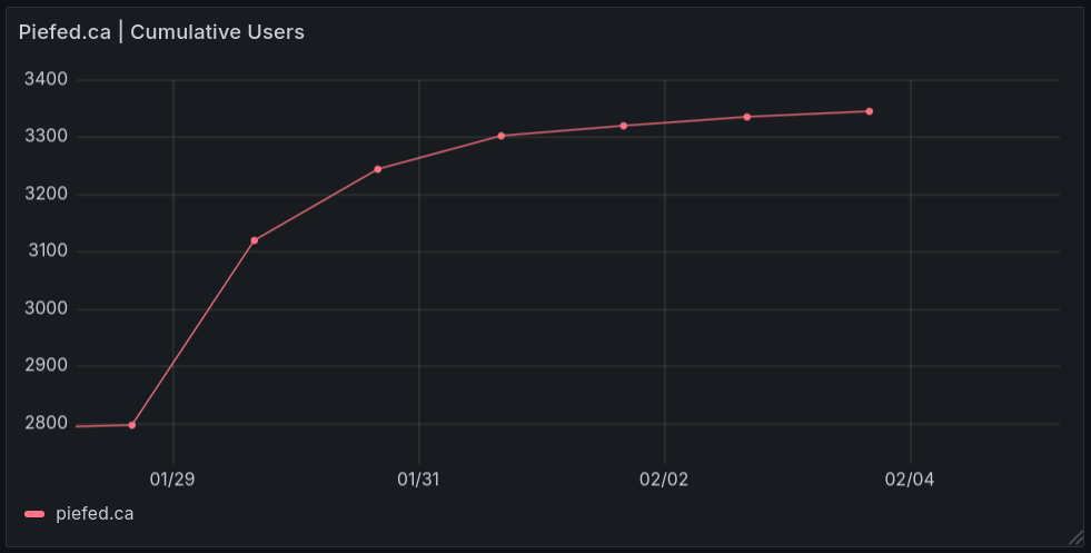
Past 14 days:
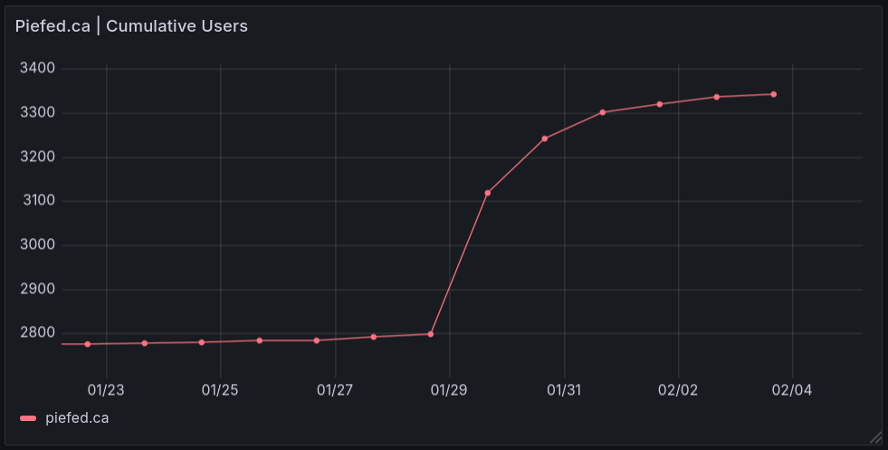
Since launch:
Amazing thanks, only seeing this now. I’ve already made a post and it seems to be blowing up.
You’re not wrong. Today’s data is from 12:20, all other days are from around 14 central European time.
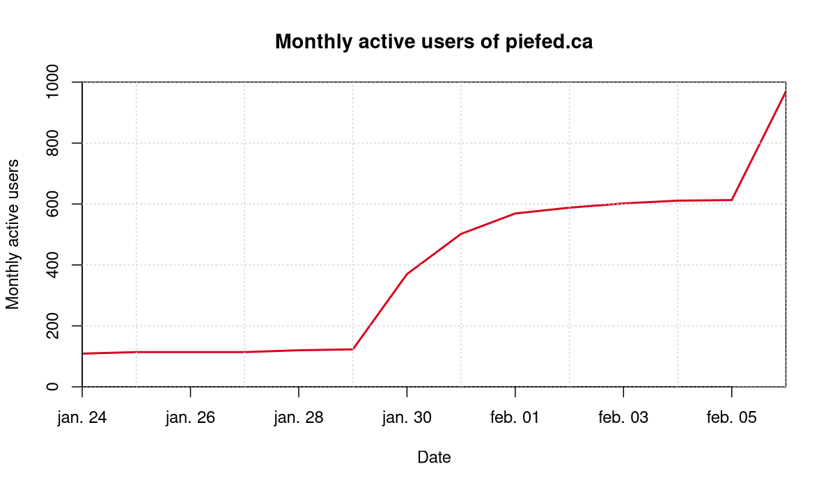
mau <- c(109, 114, 114, 114, 120, 123, 370, 502, 569, 588, 602, 611, 613, 969) Date <- as.Date(as.Date("2026-01-24"):as.Date("2026-02-06")) plot(Date, mau, type="l", ylab="Monthly active users", lwd="2", main="Monthly active users of piefed.ca", col="#D80621", xaxs="i", yaxs="i", ylim=c(0,1000)) grid()Beautiful
Here’s the number of monthly active users, which might look more impressive to people who obsess over the Y axis:
It’s not super pretty as I just threw it together and really should be doing other things. But it’s colour matching the Canadian flag, which I hope is appreciated. :)
I guess a key takeaway is that the number of active users at Piefed.ca multiplied by more than five since late January.
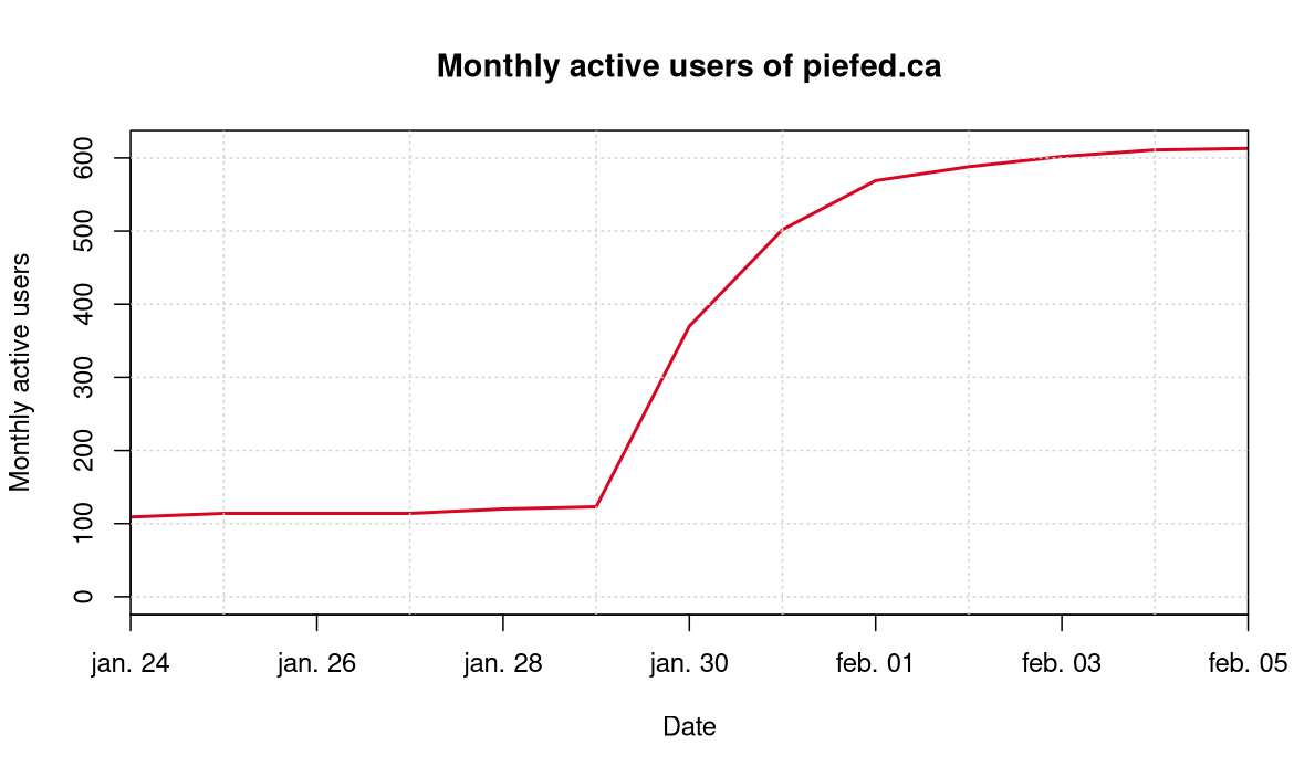
mau <- c(109, 114, 114, 114, 120, 123, 370, 502, 569, 588, 602, 611, 613) Date <- as.Date(as.Date("2026-01-24"):as.Date("2026-02-05")) plot(Date, mau, type="l", ylab="Monthly active users", lwd="2", main="Monthly active users of piefed.ca", col="#D80621", xaxs="i", ylim=c(0,613)) grid()That’s awesome. Is this growth mostly driven by Reddit outreach?
Yeah. January 29 was a post on reddit that did well and was kept up. Then if I understand correctly on the 6th it was posted again to the same community with a graph or something, but the post was not kept up. Nevertheless it caused a new pretty neat spike in users.
Current number is 1148. I’m on mobile right now, but if anyone runs this in R it’ll procduce an up to date graph:
mau <- c(109, 114, 114, 114, 120, 123, 370, 502, 569, 588, 602, 611, 613, 969, 1148)
Date <- as.Date(as.Date("2026-01-24"):as.Date("2026-02-07"))
plot(Date, mau, type="l", ylab="Monthly active users", lwd="2", main="Monthly active users of piefed.ca",
     col="#D80621", xaxs="i", yaxs="i", ylim=c(0,1000))
grid()
Active users have now doubled in a week. Though it’s a slightly misleading measure as an active user that just signed up is much less reliable than an active user who signed up two years ago. But that doesn’t really matter if the purpose is to use it for promotional purposes. :)
The middle one at https://piefed.fediverse.observer/piefed.ca should work nicely:-)
I wish it was weekly or daily, it doesn’t really pop and a good image is so important.
I didn’t think it would work on reddit 🤔 but could try
Oh I thought it was daily but you are right it’s monthly (it’s super hard to see it on my phone screen). One of the buttons on the bottom, for Additional Checks Data, has data provided multiple times per day, if someone wants to make a chart from the raw numbers.