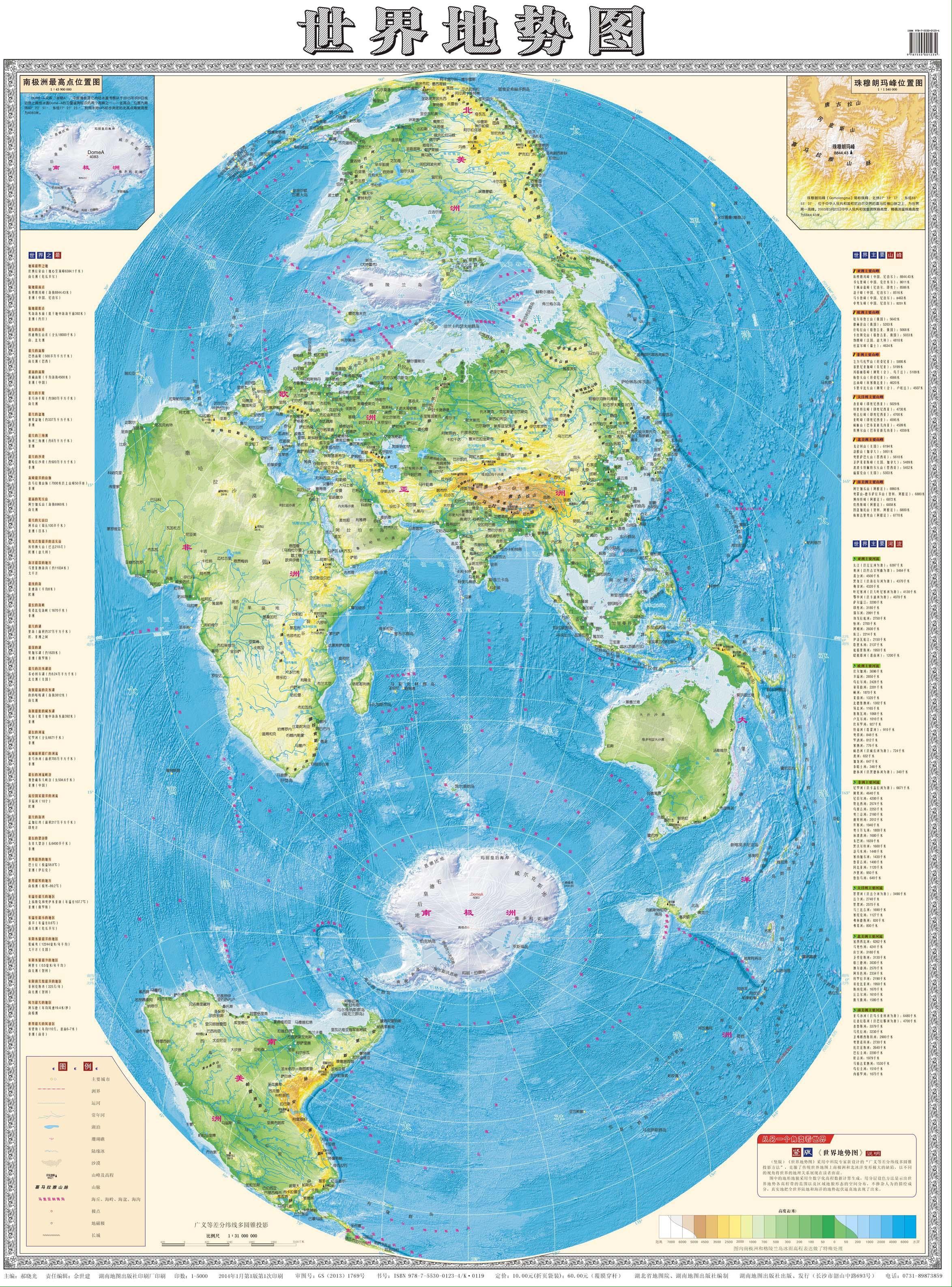
It is quite funny to see the US and the Americas generally kinda cast to the side in this map.
While it’s obviously putting China and Asia in the middle (actually looks like India is right in the middle) … as far as making certain areas look bigger or smaller than actually are, compared to the standard mercator style projections … Russia and Greenland seem to be the “losers” here while Africa looks relatively huge.
Africa is huge- many people underestimate it, although in this case it is a bit too large compared to India in the middle. Also the colorscale makes Sahara and other low desert areas too green - the habitable part is not so great.
I can’t read Chinese, but looks like the colors represent elevation, not how green an area is.
Oh I know … I noted it as a positive of the map … probably makes Africa feel appropriately big compared to the rest of the world.
both are “generally” cast to the side. London is primal
Americas are cast to the side of the map. They center on Europe.
India actually, as no way Spain is ~1/3 of India in reality. They probably take advantage of the area of China being subtly enlarged.
I meant on regular maps, americas are to the side too.
Seems to make Antarctica look a lot smaller than it is too.